Buick Visual Redesign
UX Lead
Developed while at MRM as a Senior UX Architect
Overview
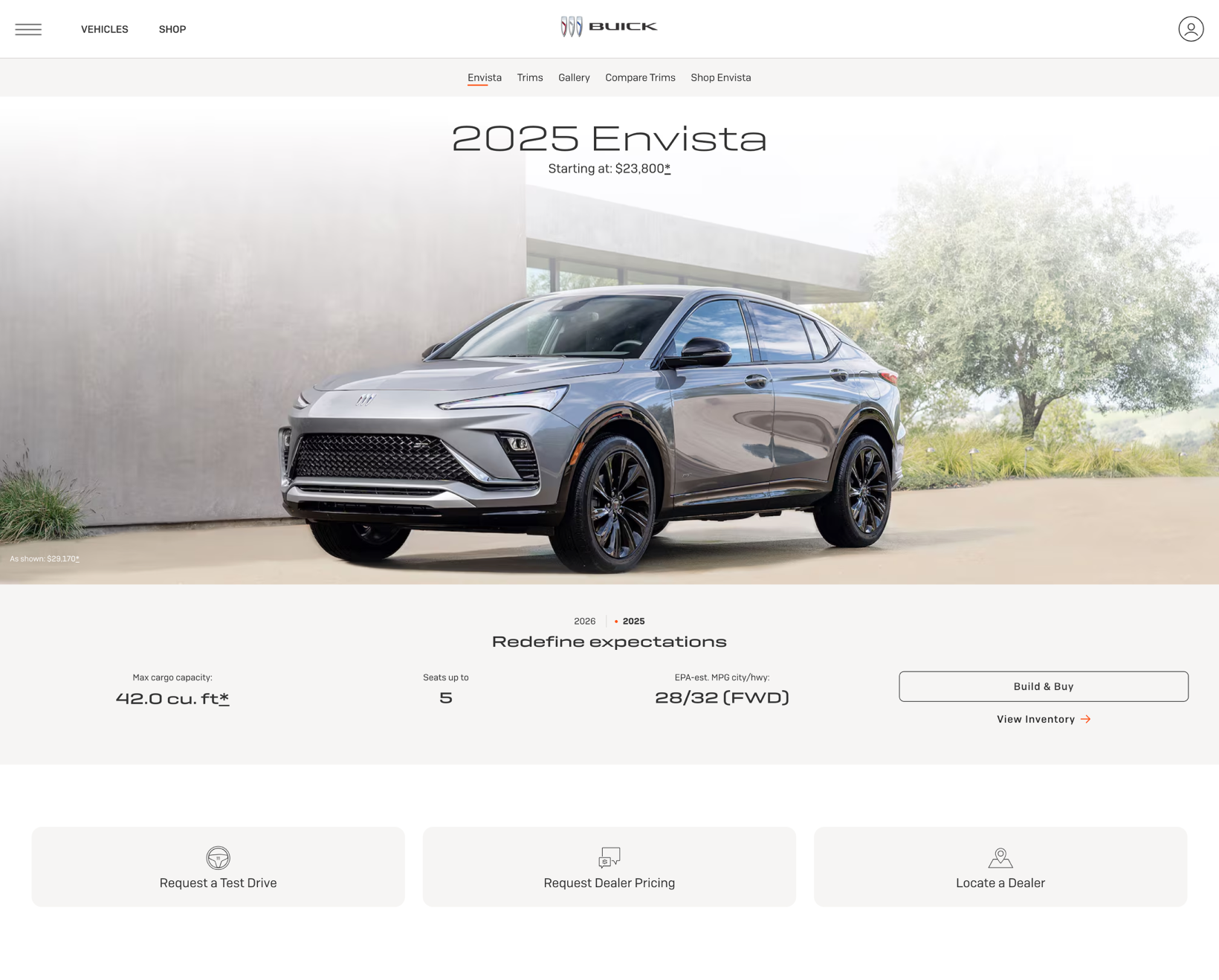
Buick was traditionally viewed as a brand for older demographics, but they wanted to reshape their image and attract more diverse buyers. They needed a comprehensive visual redesign of their digital experience, focused on modernizing the brand’s look and feel while improving design consistency at scale. Core elements were redesigned to create a more polished and intuitive user experience, while maintaining accessibility and usability standards. The result was a cohesive visual system that elevated the overall aesthetic, streamlined design-to-development workflows, and delivered a significantly refreshed digital presence for Buick.
Contributions
UI Styling
Wireframing
Prototyping
AEM Building
Presenting
Process
The project began with a full update of the Figma design library, where we established a cleaner, more contemporary visual language through refined typography, color usage, spacing, and component styling. This foundation ensured the system was flexible, cohesive, and aligned with Buick’s evolving brand direction.
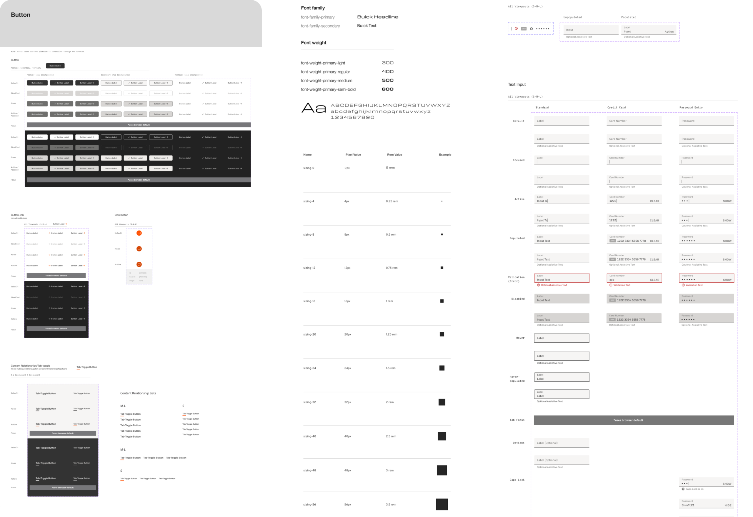
By standardizing components, styles, and patterns, the library improves scalability, makes future updates easier to implement, and helps maintain brand and UX quality as the product evolves.
Implementation
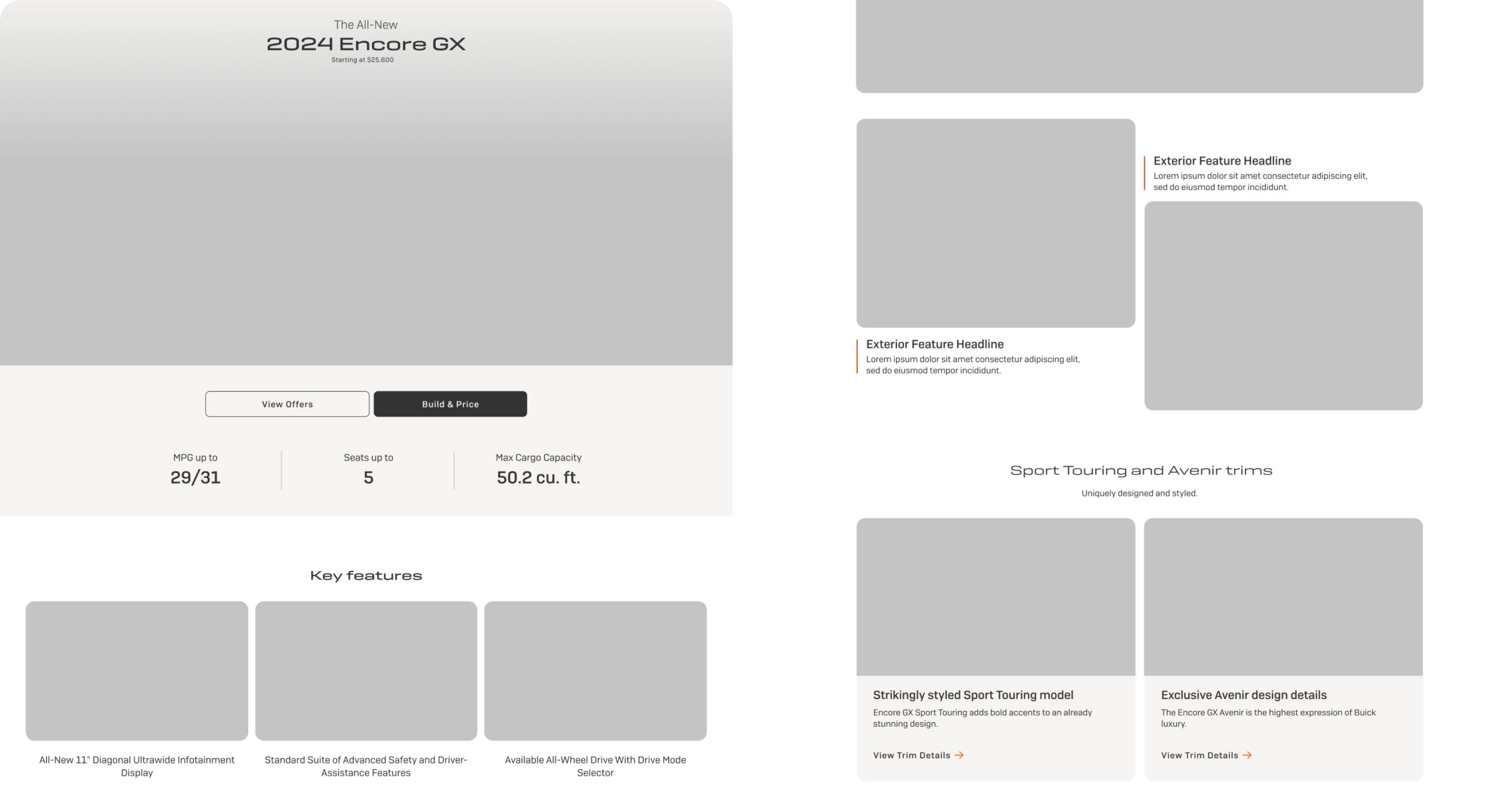
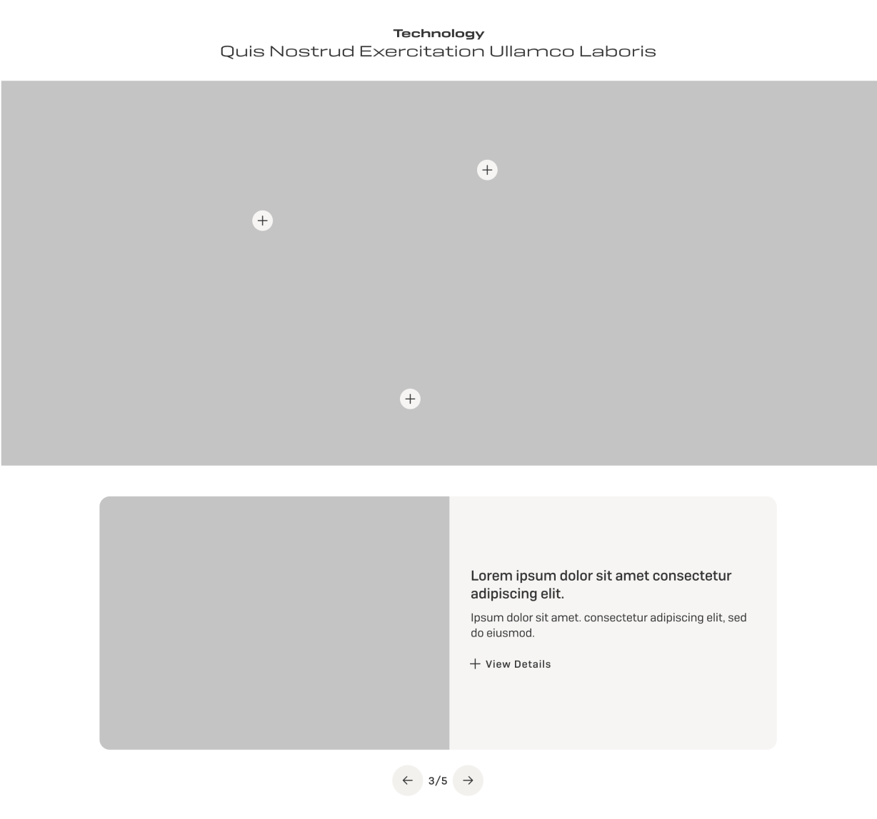
Our UX process focused on translating the Figma library’s styles into scalable, production-ready page components. We began with low-fidelity wireframes to validate component structure, layout patterns, and content hierarchy before final visual styling was applied. The wireframes were tested across multiple viewport sizes to ensure responsiveness, usability, and consistency.
Once component layouts were validated, we applied the Figma library styles to each element, ensuring alignment with the established visual system. This approach allowed us to systematically implement typography, color, spacing, and UI while maintaining design integrity across pages.
Results
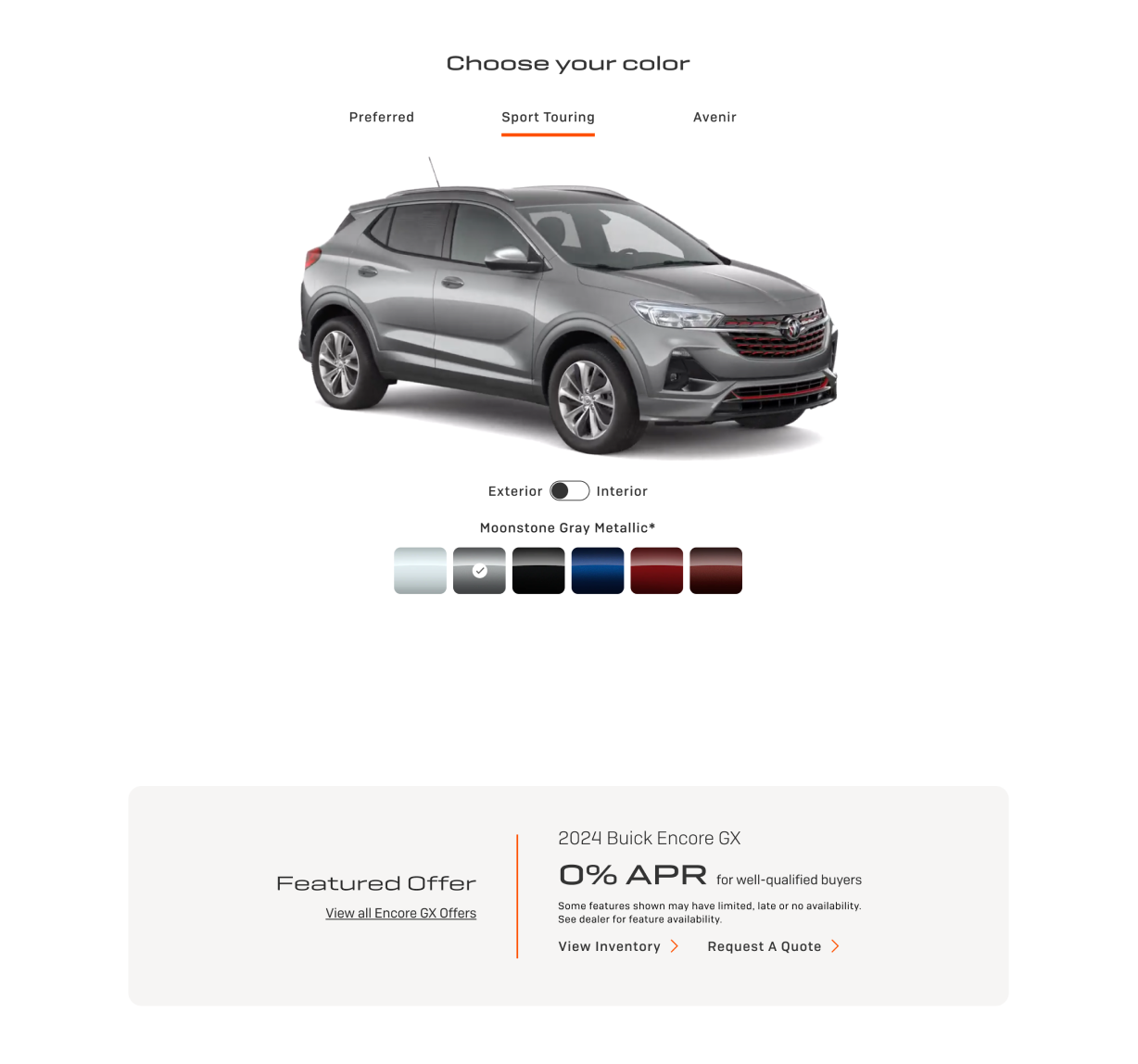
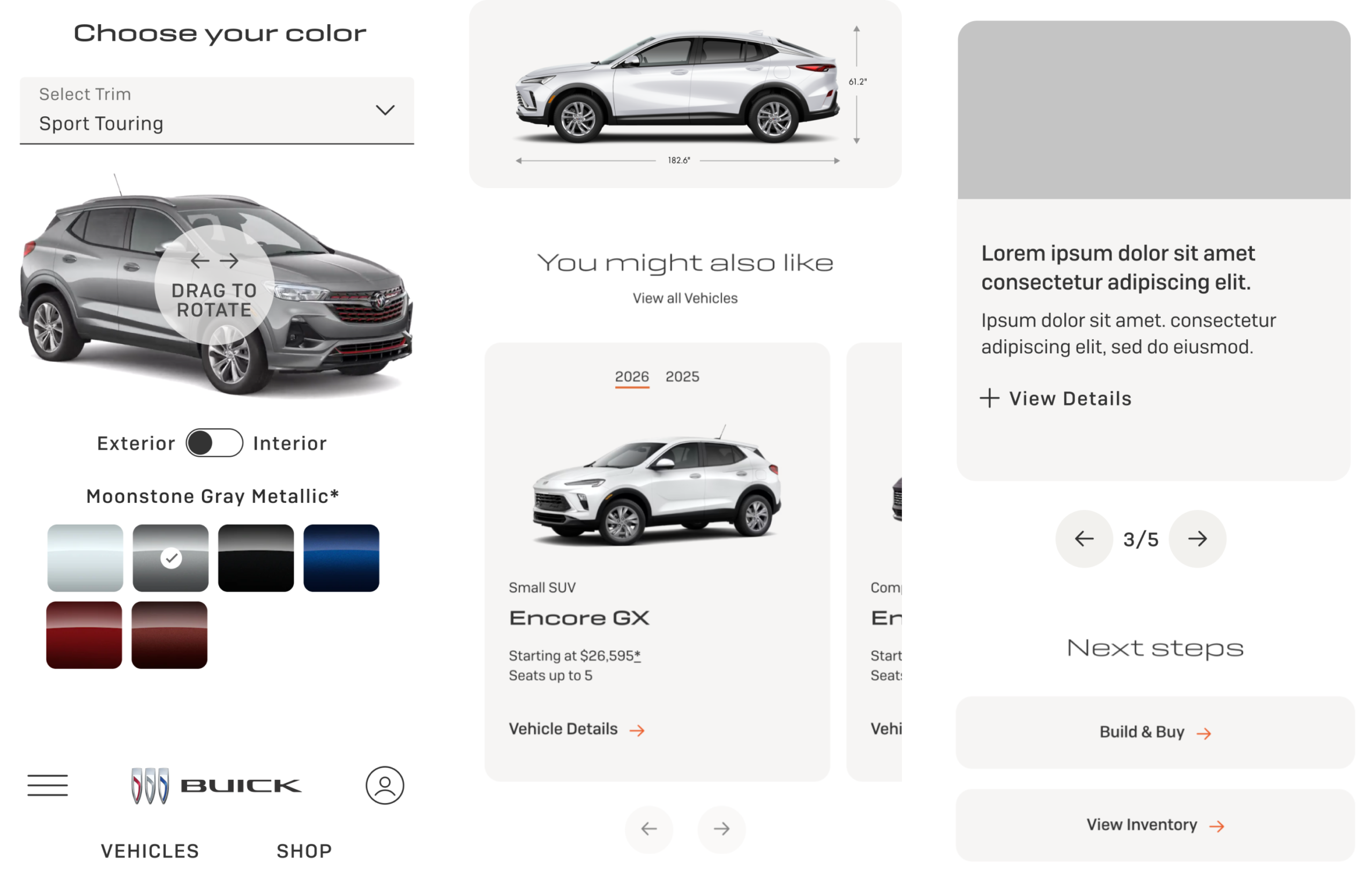
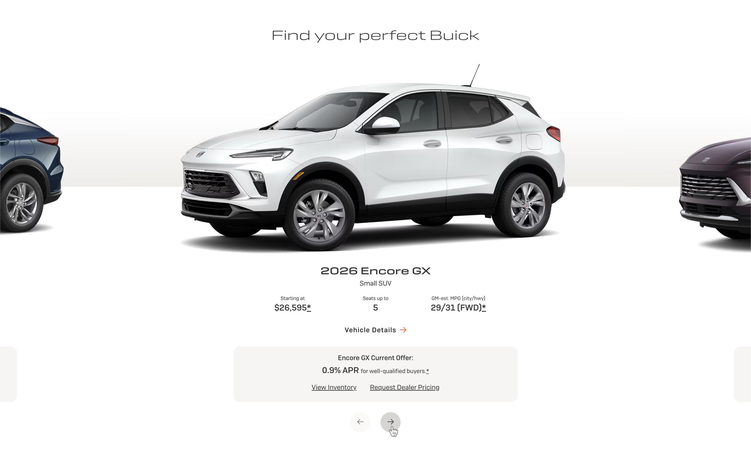
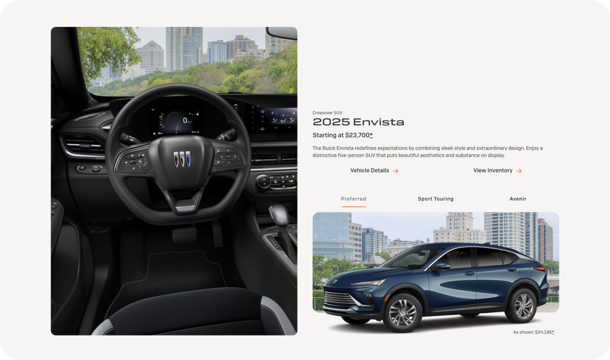
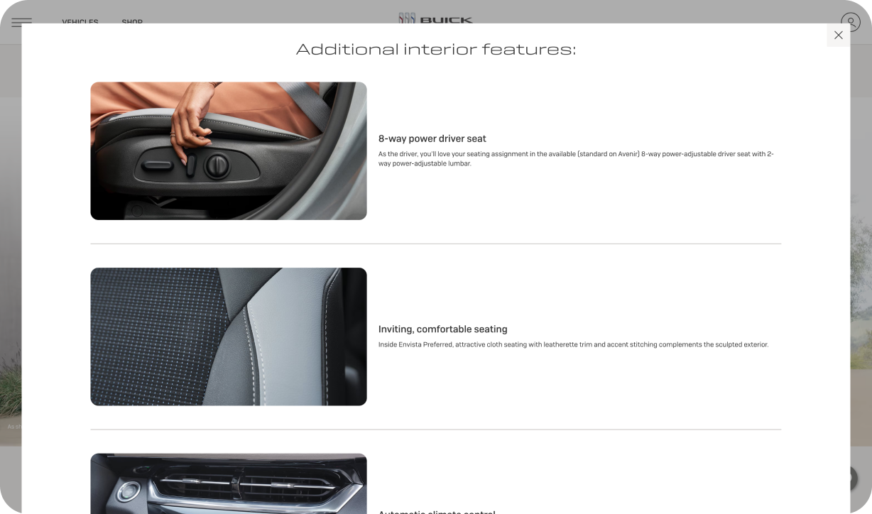
The updated visual identity for Buick resulted in a more refined digital presence that clearly reflected the brand’s evolution. By adopting a clean, straightforward, and uncluttered design approach, the experience feels more premium and intentional while remaining easy to navigate. The simplified layouts and focused visual hierarchy elevated key content and reduced friction, allowing users to engage more easily with high-value behaviors.
This refreshed design language helped reposition Buick to better resonate with a younger demographic without alienating existing audiences. Rolled out across the homepage, 2025 vehicle pages, and all core brand pages, the cohesive visual system created a unified experience that strengthened brand perception, improved usability, and supported Buick’s long-term digital strategy.

👋 Want to connect?