GMC Global Brand Design System
UX Lead
Developed while at MRM as a Senior UX Architect
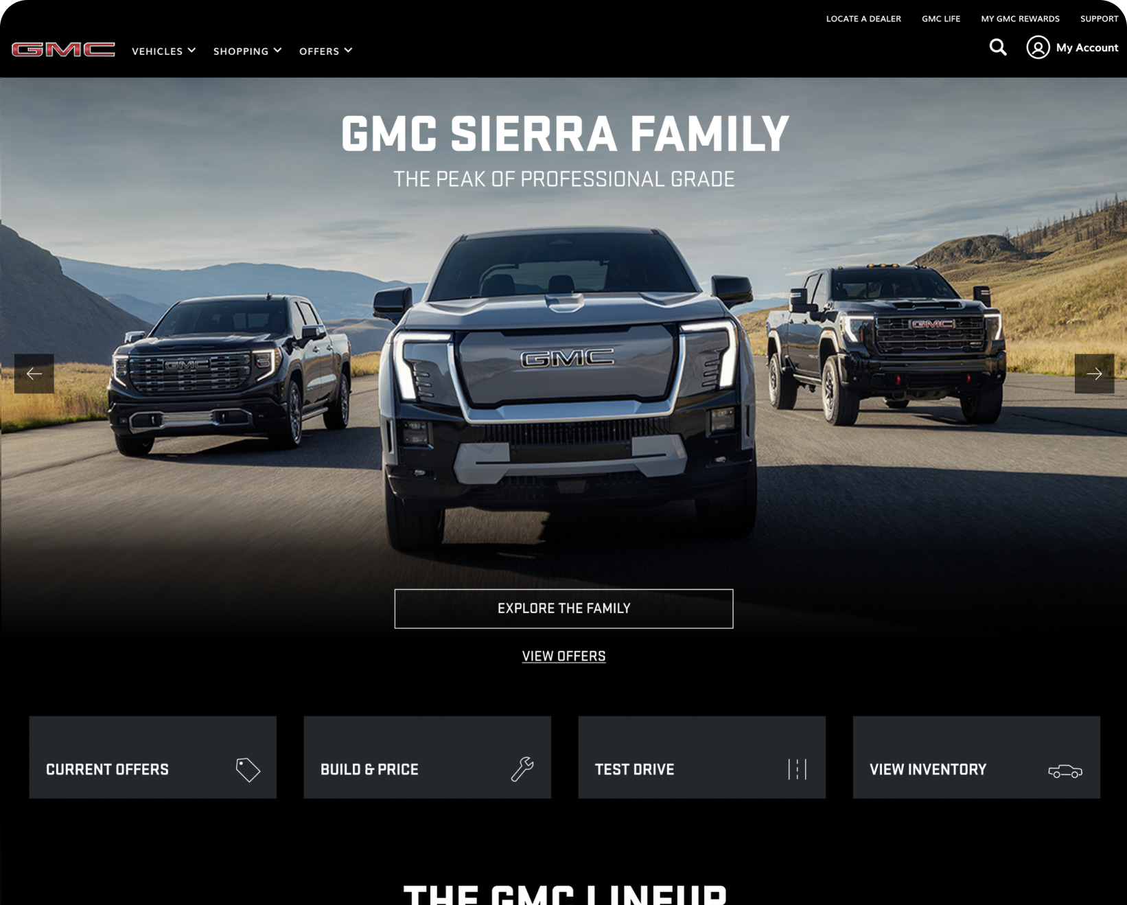
Overview
GMC set out to refresh the visual experience of its website by updating styles across the platform to create a cleaner, more modern look that better reflects the brand today. The project focused on evolving the existing design language while maintaining familiarity for users and ensuring consistency across all digital touchpoints.
Collboration across account management, strategy, creative, and UX ensures alignment between client objectives, measurable outcomes, compelling execution, and user-centered experiences.
Contributions
UI Styling
Wireframing
Prototyping
AEM Building
Presenting
Process
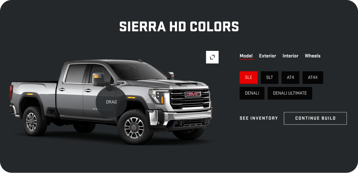
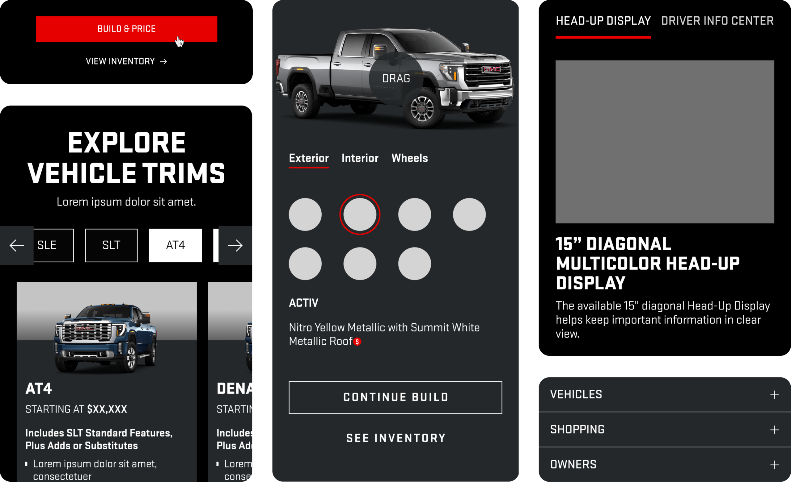
At the core of this initiative was a comprehensive update to GMC’s Figma library. We refined foundational styles — such as color, typography, spacing, and UI treatments — to reflect an elevated brand identity while meeting accessibility and usability standards. These updates were then systematically applied to shared components and page-level patterns, ensuring visual consistency and reducing design and development debt across the site.
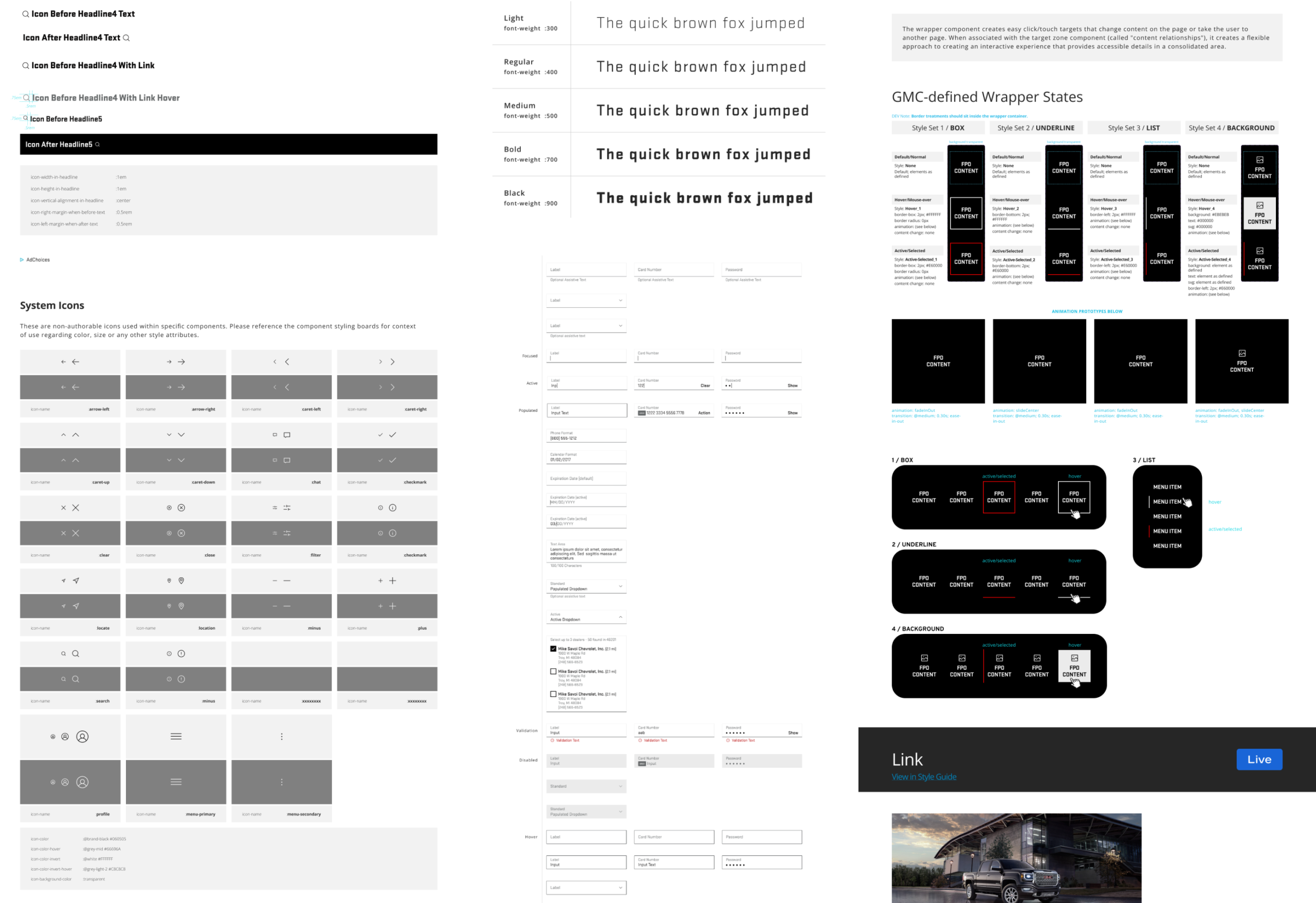
By working within a centralized design system, the project emphasized efficiency, alignment, and scalability. The updated library enabled designers and developers to work from a single source of truth, accelerating workflows and ensuring consistent implementation across teams.
Implementation
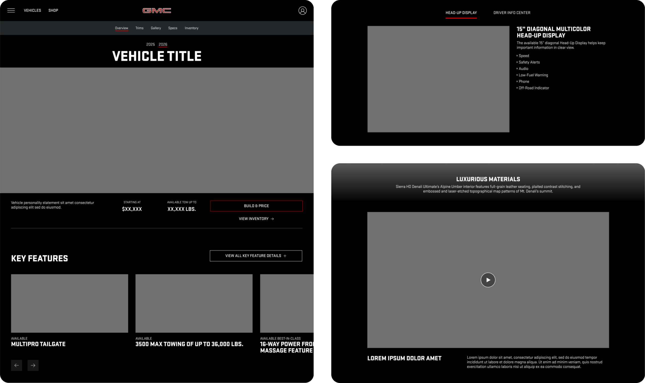
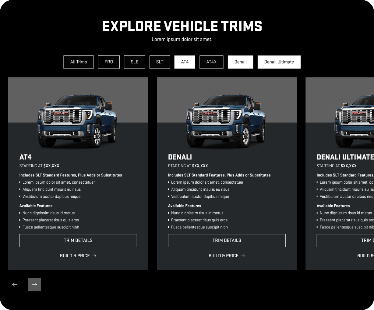
After finalizing and receiving approval on the updated styles within the Figma library, we transitioned the design system into site-ready components and patterns to establish a cohesive foundation across the entire GMC website. To validate the system’s flexibility and scalability, we began by laying out wireframes across multiple viewport sizes. This allowed us to test each component and pattern in a variety of real-world scenarios, ensuring they functioned effectively across responsive breakpoints and different content needs. By addressing layout, hierarchy, and behavior early in the process, we reduced inconsistencies and avoided rework later in production. Once validated, these components were refined into efficient, reusable patterns that could be confidently applied across pages.
Results
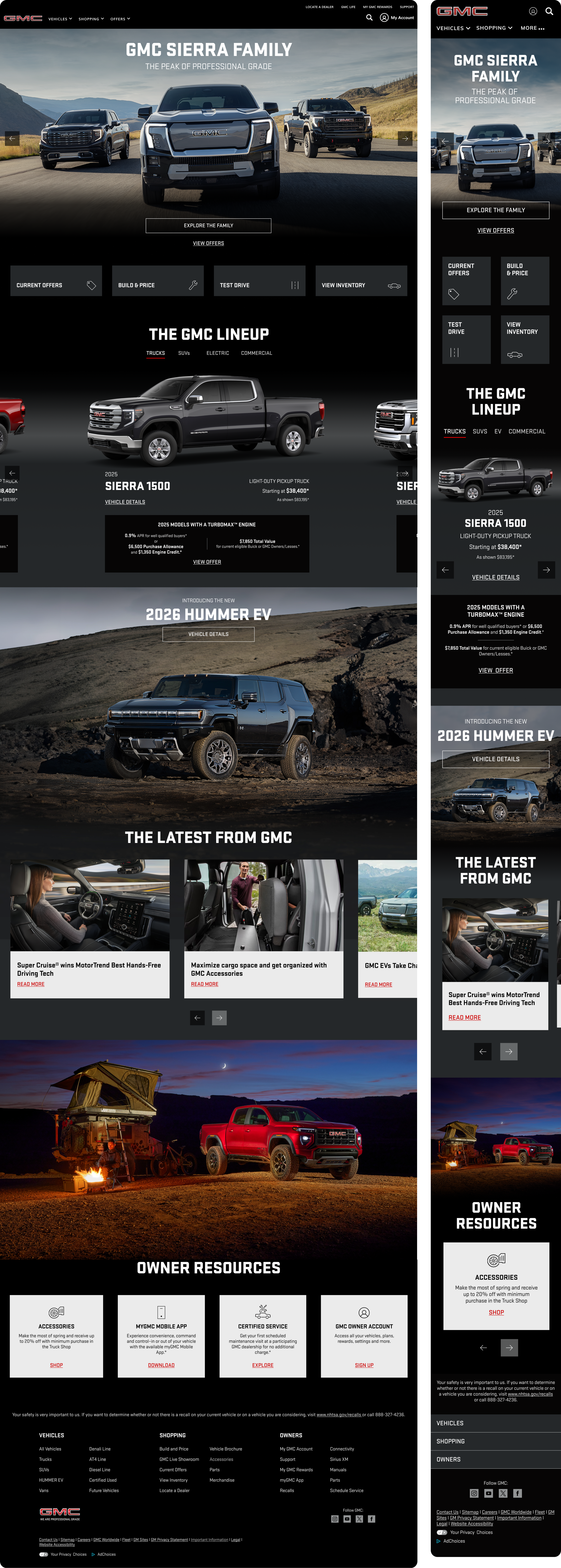
To introduce the refreshed brand experience, the homepage was selected as the first page to showcase the updated styles and components. As the most visible and high-impact entry point, the homepage served as a proof of concept for the new design system which demonstrates how modernized styling, accessible design, and consistent components could come together to present an elevated brand.
Mass Market Rank
#1
Overall Satisfaction
+54%
Speed
+56%
Navigation
+55%
Research
To validate the effectiveness of the updated homepage and ensure the refreshed design met both user needs and business goals, we conducted qualitative user research focused on visual design, usability, content comprehension, and navigational clarity. Collaborating with the strategy team, we outlined the research objectives to have clearly defined data points.
1.
Gather feedback on the overall visual design, usability of the homepage, and perception of the GMC brand
2.
Assess how users interpret and engage with the content and sections, evaluate if it’s meeting expectations
3.
Examine how effectively users identify and follow navigation cues to complete next-step actions
Participants consistently described the updated homepage as modern, slick, and bold. The layout was perceived as well-organized and easy to navigate, allowing users to quickly understand the structure of the page. The GMC Lineup and Shopping Tools sections emerged as the most engaging areas, with participants describing them as functional, informative, and directly tied to their shopping and discovery needs.
Overall, the homepage met or exceeded expectations, particularly in sections focused on exploration, comparison, and next steps in the purchase journey. The experience reinforced or improved their perception of the GMC brand, aligning the refreshed styling with expectations of a strong, contemporary automotive brand.
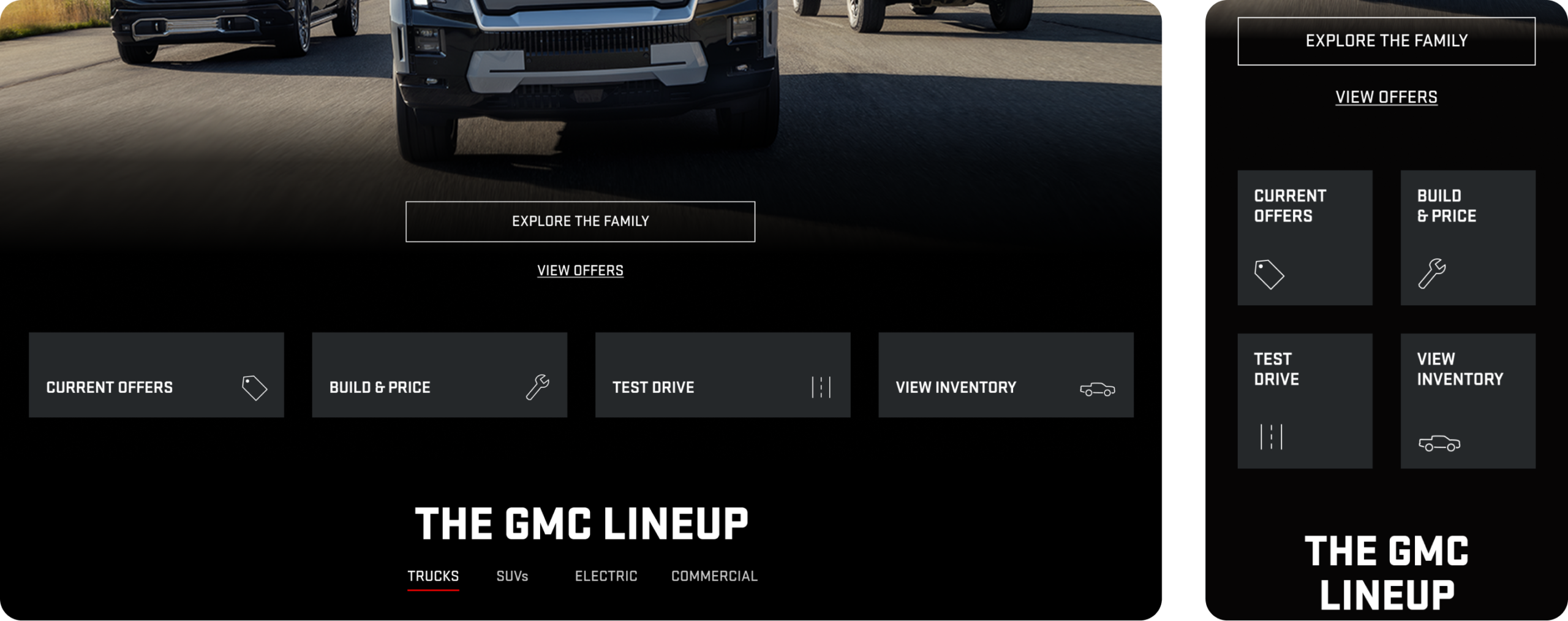
The Shopping Tools buttons were seen as appropriate, useful, and expected for a homepage.
“It’s everything you need right there.”
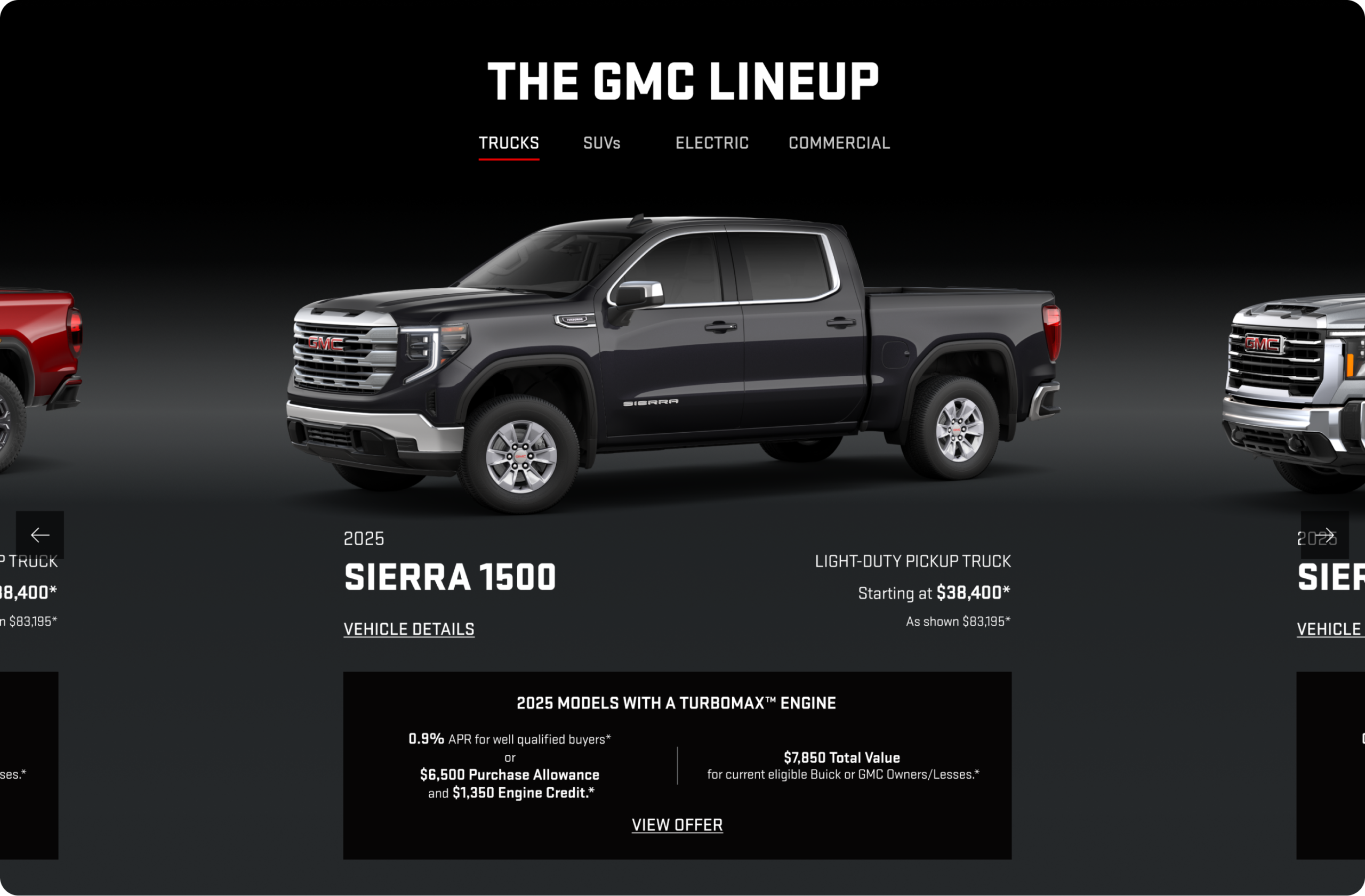
Participants found the section intuitive and easy to interact with. There was no confusion about how access more details and users appreciated the ability to browse by vehicle category.
👋 Want to connect?