
GMC 2027 Vehicle Refresh
GMC set out to refresh the visual experience of its vehicle pages by updating styles across the platform to create a cleaner, more modern look that better reflects the brand today. The project elevated the experience with a bold, editorial-inspired design, encouraged purchase consideration, and preserved user familiarity.
This work was completed as part of my role as Lead UX Architect at MRM. The project was a collaborative effort involving designers, strategists, project managers, and client stakeholders.
Contributions
UX/UI Design
Visual Design
Wireframing / Prototyping
AEM Build
Brand Library
At the core of this initiative was a comprehensive update to GMC’s Figma library. Foundational styles were refined — such as color, typography, spacing, and UI treatments — to reflect an elevated brand identity while meeting accessibility and usability standards.
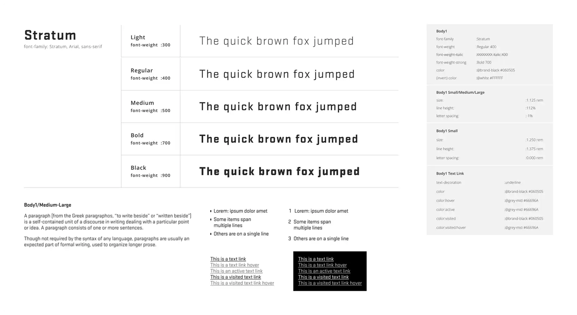
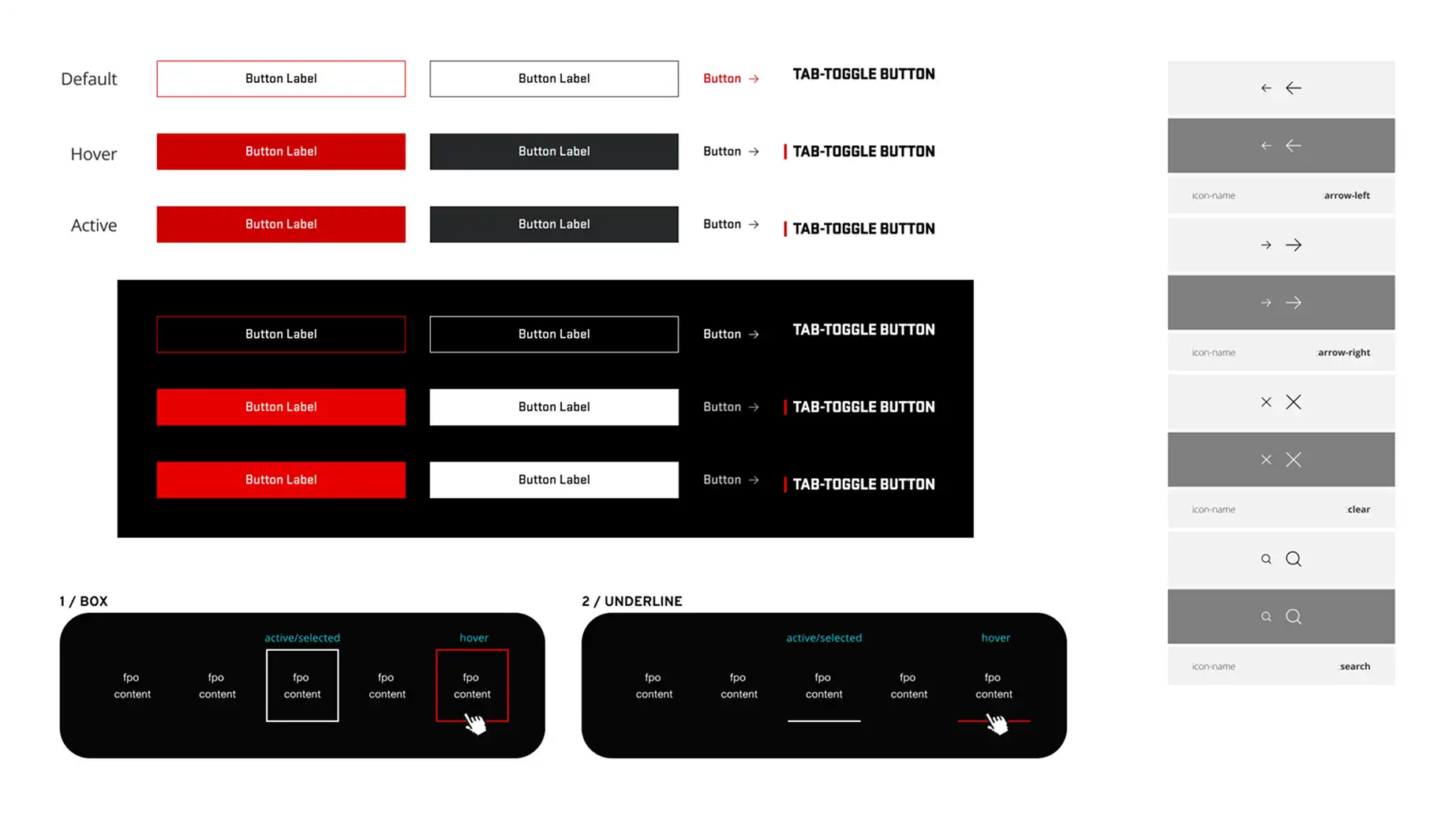
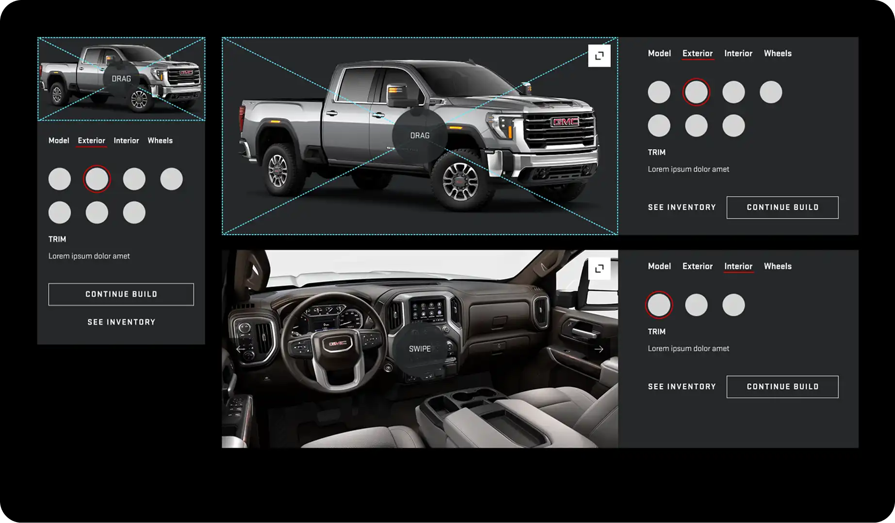
Styling updates were applied to page-level components and patterns, ensuring visual consistency across the site.
Vehicle Overview
The initiative focused on transforming traditionally static product pages into an immersive, editorial-style experience that helps users envision ownership. Each vehicle's personality is showcased while guiding users toward discovering relevant information throughout their shopping journey.
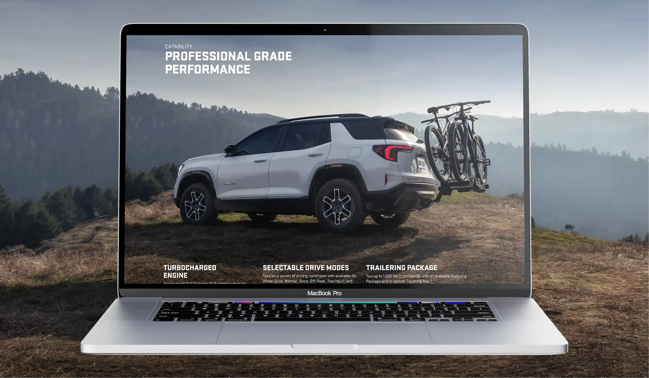
Bold imagery and dynamic storytelling create a deeper emotional connection to the vehicles.
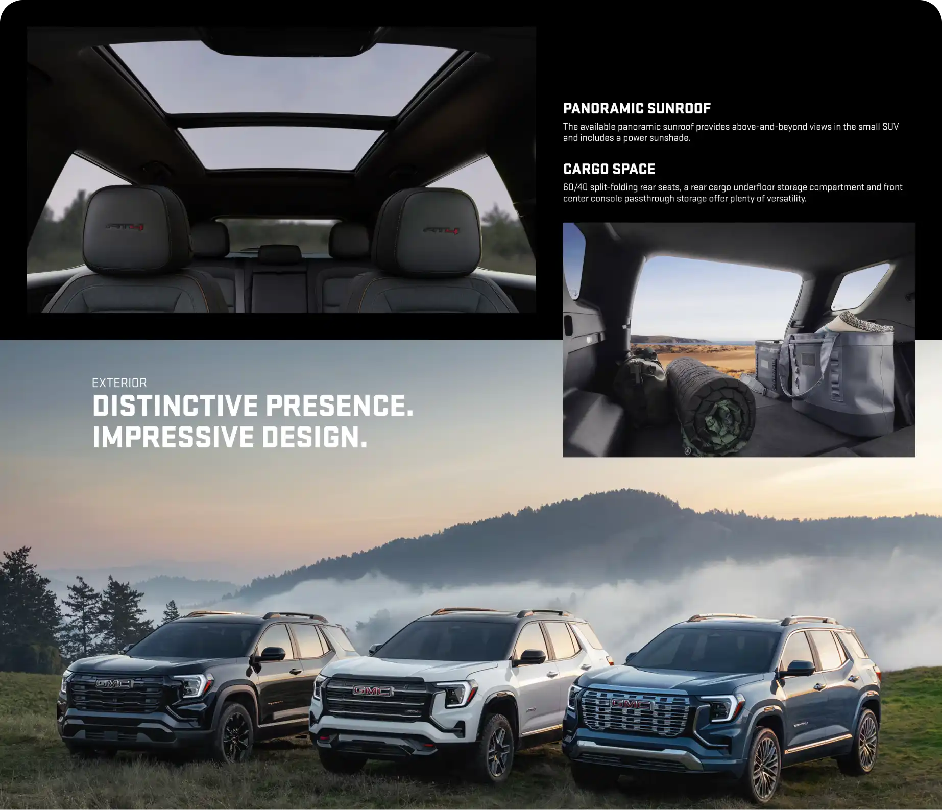
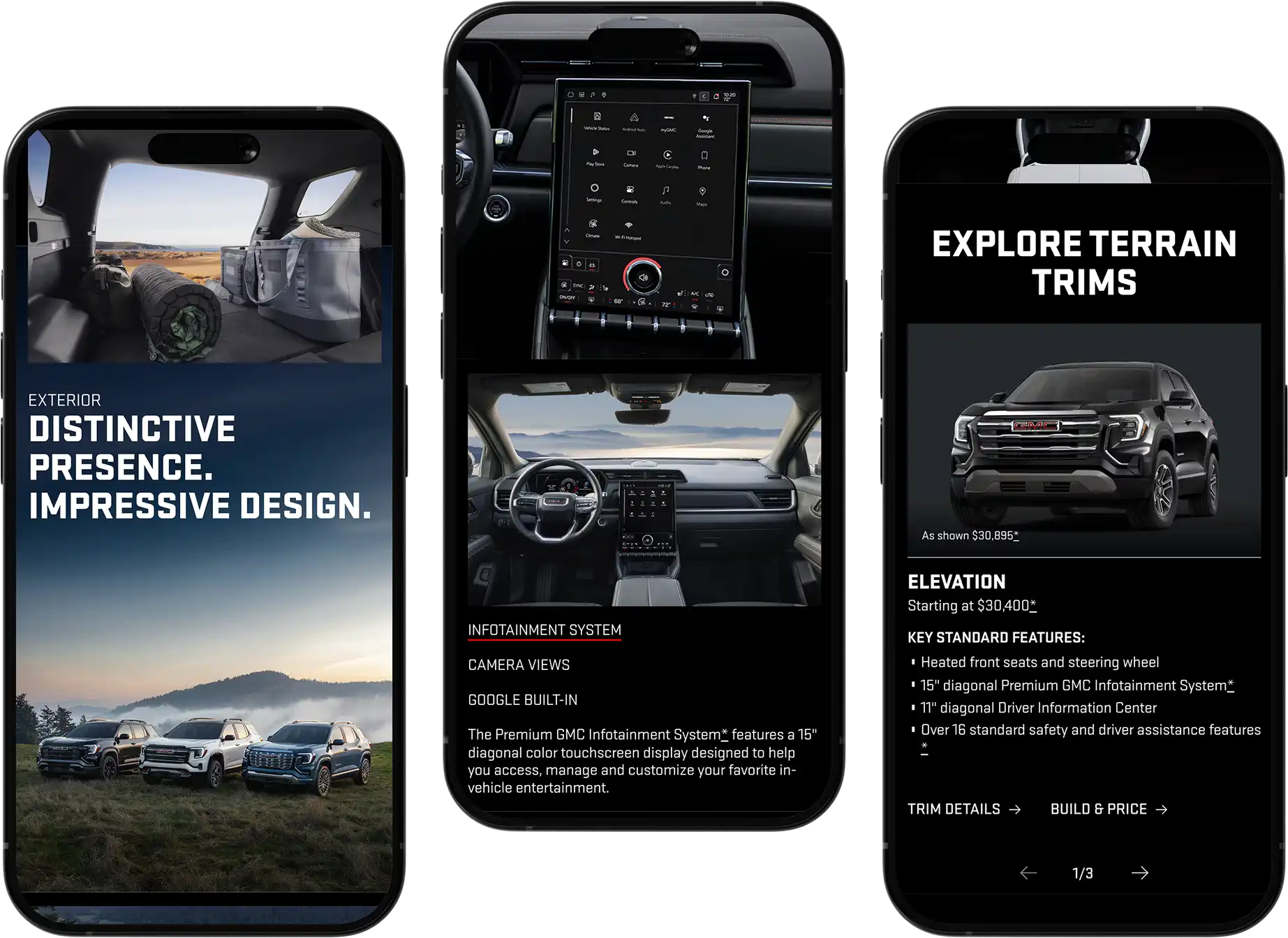
Interactive components create a more engaging browsing experience.
79% of users scrolled further to seek out additional information on mobile.
Vehicle Trims
While the vehicle overview pages were designed to inspire and generate interest, the trim pages serve a different purpose by helping users quickly evaluate specific configurations and confidently move toward purchase-related decisions.
A need for faster access to the details shoppers use most when comparing options was identified through user research.
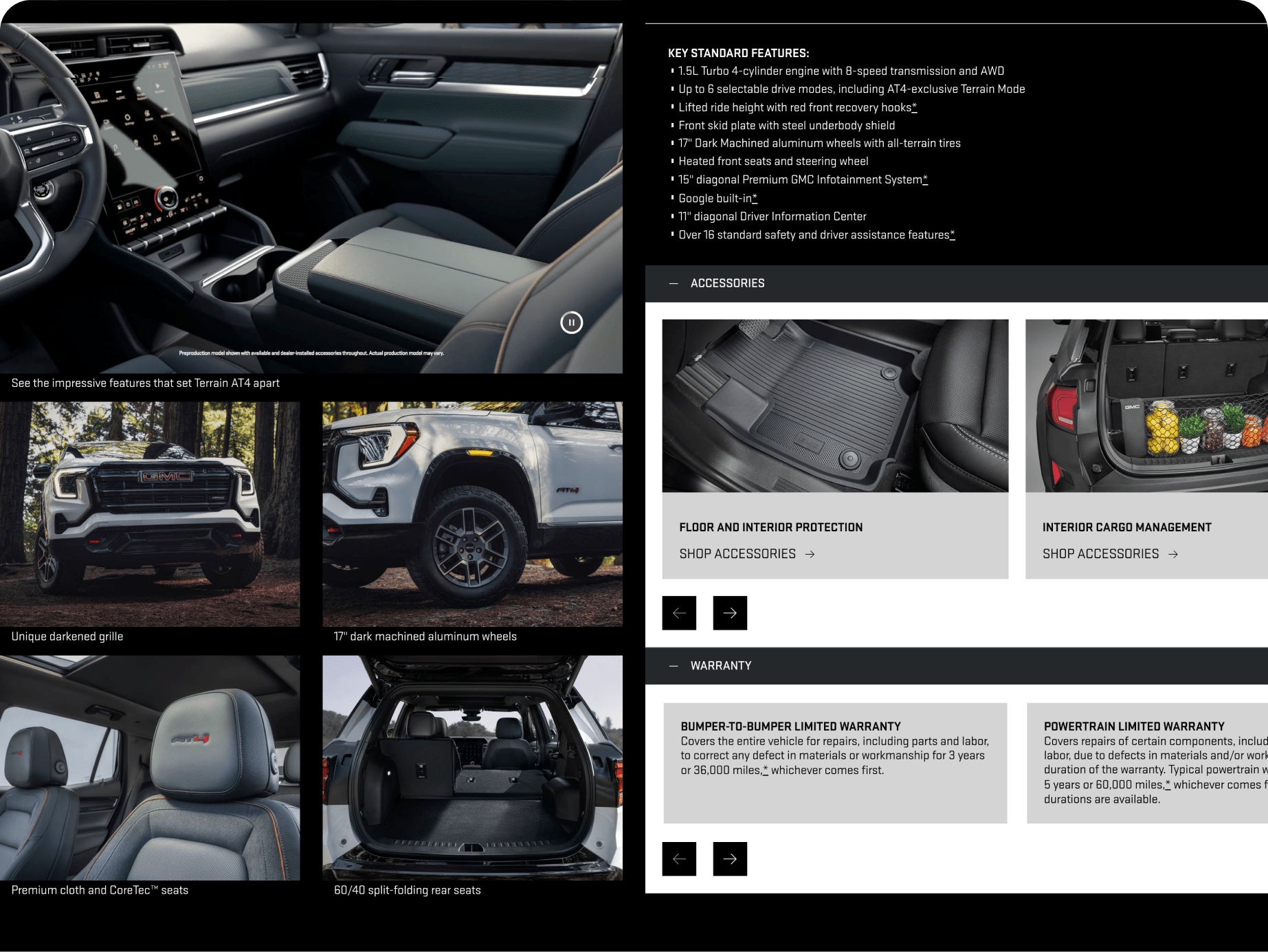
Over 8 in 10 users found the redesigned trim page clear, easy to understand, and well organized on mobile.
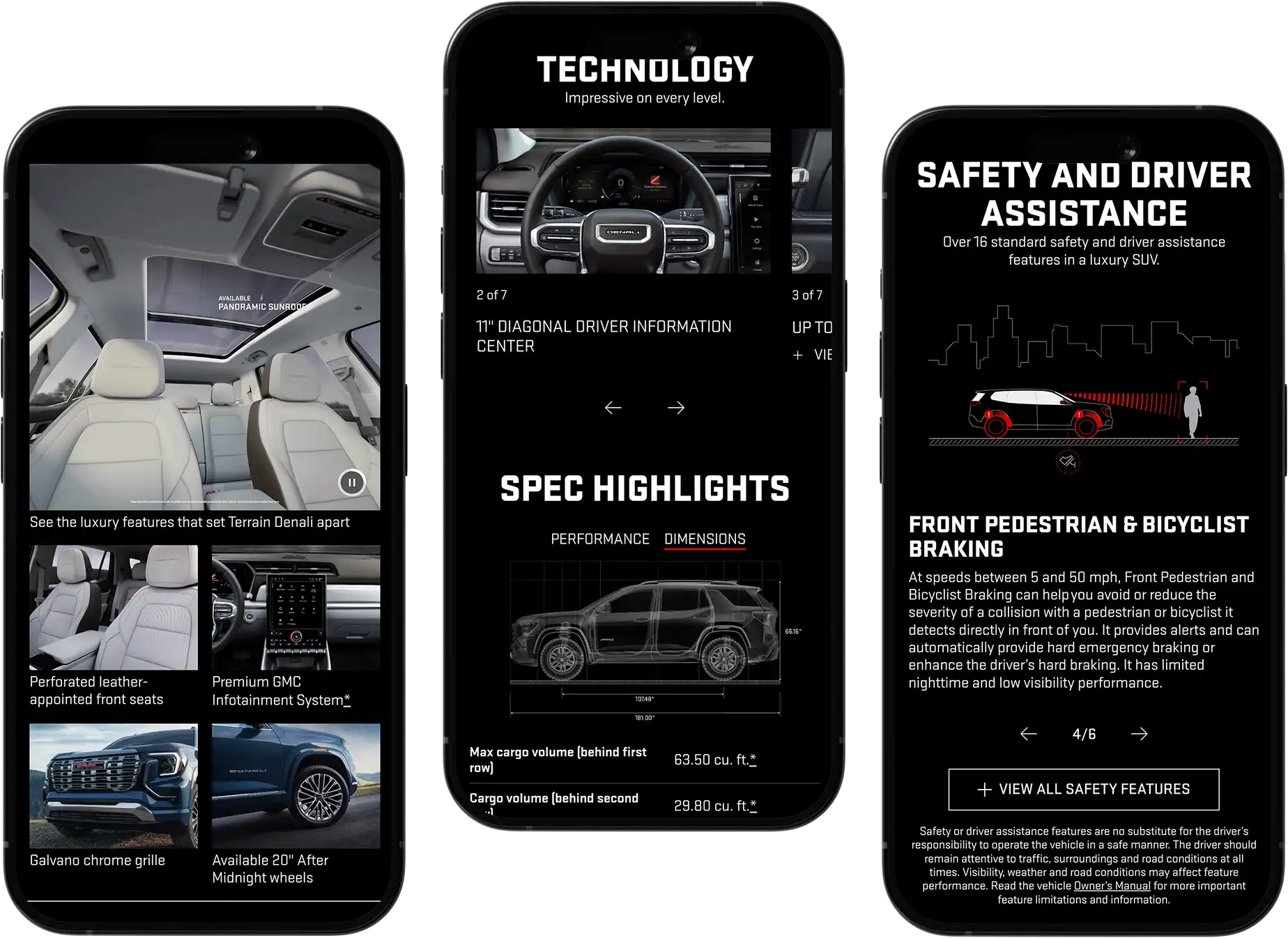
Gallery Page
The new experience centers around a highly visual grid-based layout that enables users to efficiently scan and browse a large collection of imagery. By surfacing more content upfront, users can quickly gain an understanding of the vehicle's design, features, and craftsmanship without navigating through multiple galleries or image carousels.
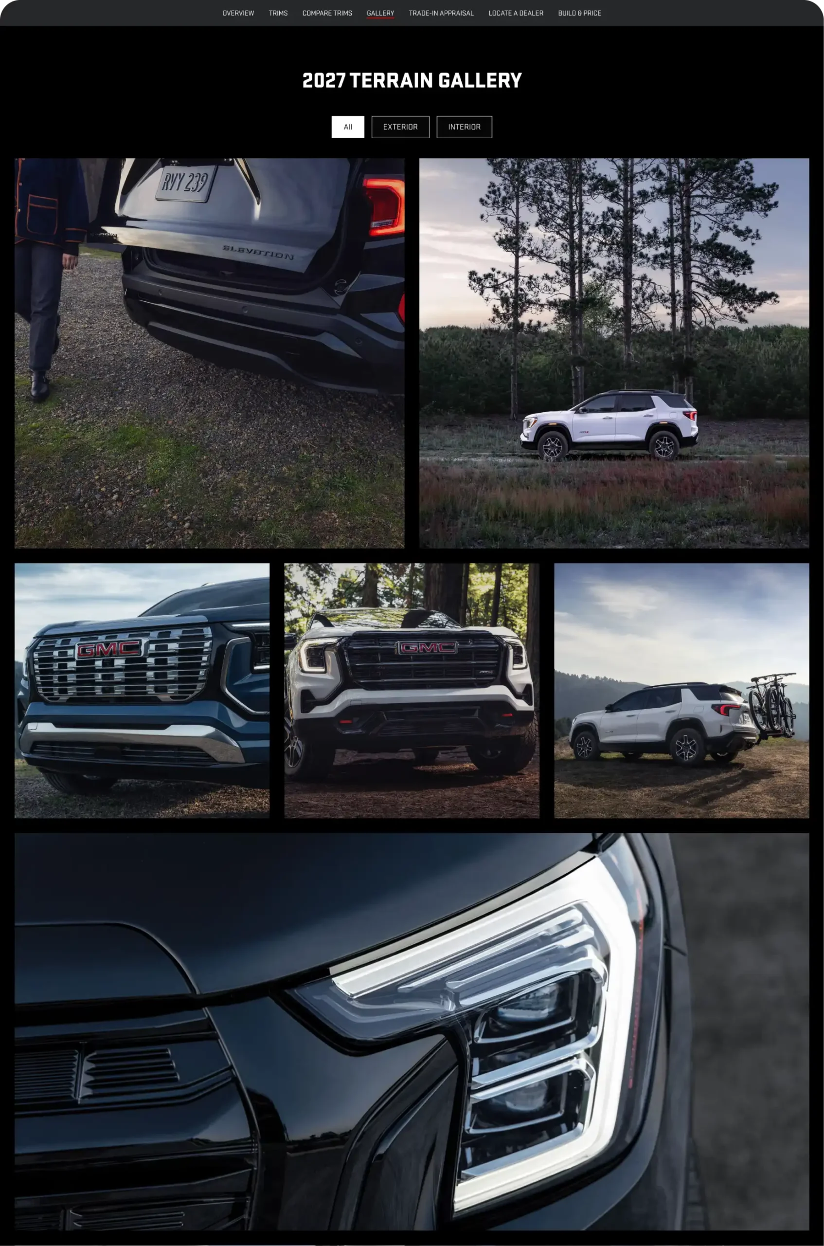
To further improve content discovery, filterable image categories were introduced to focus on key shopping considerations.
Research & Results
User testing showed a clear preference for the 2027 experience over 2026 across mobile and desktop. Larger imagery and integrated video effectively showcased the vehicle and captured attention. Users also responded positively to the clearer layout, easier navigation, and side-by-side comparisons. Many users were more likely to scroll and explore deeper into the 2027 page, indicating stronger content engagement.
The 2027 Sierra HD Vehicle Overview Page outperformed the 2026 version across most measured attributes, especially in its ability to capture interest and present complex vehicle information in a clear and accessible way.
65%
2027 PREFERENCE
+82%
PREMIUM BRAND
+82%
CAPTURES INTEREST
+80%
VISUALLY APPEALING
👋 Want to connect?
ALL WORK
ABOUT ME
RESUME